Social | Share Your Trip: modhop Google+ Community!
On Google+? Join the our new Google+ community! – Over the past few weeks I’ve built up a small collection of posts to get things started. Now, we’d love to […]
 play_arrow
Anthony’s Philippines: “It was an Adventure” Jake Redman
 play_arrow
Anthony’s Amazing Singapore: “Toe Dipping” Point of SE Asia Jake Redman
 play_arrow
Anthony’s Ireland: Hellman’s Makes Ketchup Too Jake Redman
 play_arrow
Dallas, Disney and Deals. Our 100th Episode. Jake Redman
 play_arrow
AirBnB Cancels Some Cancelling & Jake Thinks Charlotte is a Beach Town Jake Redman

When American Airlines changed their logo and look, everyone dropped what they were doing and began their often angry-sounding, armchair “VP of liveries” critiques. But as Tiger Airways becomes the new “TigerAir”, our collective graphic designer sense smiles and moves on. Maybe it’s because Tiger is a much smaller airline, or that it’s just really far away…Or maybe it’s that we’re happy to see TigerAir come to realize that a smiley-face logo is far more welcoming than an angry, flesh-hungry tiger.
Here’s the airline’s own introduction to the new look:
The rebranding comes as Virgin Australia (once a fierce competitor on some routes), picks up 60% control of Tiger now that final approval from governing agencies is done. news.com.au reports that the Tiger was at risk of extinction had Virgin not stepped in so we’re fairly certain that the new influence played a role in developing the updated look.
The new logo, livery and happier tones make their way from the outside of the airplane to the overall TigerAir experience. Wanting to see if the new look had influenced the online booking process we worked up a mock booking to compare it with our previous experience with the former Tiger Airways site. We found that little changed other than the look. (That’s not a bad thing.)

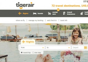
The new front page is less cluttered and makes the booking interface simpler. Bigger fonts and prettier pictures combine to make this a more welcoming space.
The most recent front page before the re-brand wasn’t necessarily difficult to navigate, but the improvements put booking your trip front and center in a way that makes it appear far less technical.
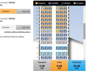
What we were most concerned about were changes to the airline’s on-board product. Our biggest question: “Can we still upgrade to an extra legroom exit row seat at booking?”. The answer is a simple “Of course they’ll let you give them more money, stupid!”
It’s also easier.

The improved seat map is more colorful and in-line with airlines competing in the same space. A simple outline of what each seat will cost is clearly stated at the bottom of the seatmap during the booking process. Choosing any seat on the plane in advance comes at a cost but it ensures you don’t end up in the middle. Sitting near the front will cost a little more and “Preferred” extra legroom seats (exit rows) come at the highest price. See our full review of exit row 13 aboard a Tiger A320 to see if the extra legroom is worth the cash. (Spoiler: Not really).
This fresh coat of paint to TigerAir’s image doesn’t move far beyond cosmetics for now. In the next few years you might watch out for incremental increases in fees while the airline continues to grow throughout Asia.
Watch our modhop in a preferred exit row seat aboard what was THEN Tiger Airways:

Modhop Host & Founder Jake Redman brings years of global exploration and travel tips to the podcast and our videos at Modhop. Jake is also a Producer and Host for SiriusXM.


On Google+? Join the our new Google+ community! – Over the past few weeks I’ve built up a small collection of posts to get things started. Now, we’d love to […]
© 2026 modhop All Rights Reserved. Unauthorized use and/or duplication of this material without express and written permission from this site’s author and/or owner is strictly prohibited. Excerpts and links may be used, provided that full and clear credit is given to modhop with appropriate and specific directions to the original content.
Post comments
This post currently has no comments.